Enforted - Building a game with style(sheets)
This is the second article of the Enforted series, demonstrating my learnings about SCSS, BEM and Flex used to build the board game. To see the other articles, hop over to the intro’s overview.
Building a board game with style(sheets)
For a design-limited person like me, creating the board’s layout certainly turned out to be one of the hardest challenges. The idea was to have a monopoly-like board but with two lanes. The outer would represent the lower value resources while the inner would host the less available precious ones.
I also wanted the game to be optimized for mobile devices, so responsive design was a given. The inner me of course already said yeah sure, all the way display: block and floats. Now admit you haven’t thought the same ;) Turns out flexbox would be the better choice though since in the end so many little subtleties are handled nicely with flex features.
Without further ado, here’s what the HTML of the board looks like on a shallow level along with a screenshot for better understanding.
1 | <!-- the boards component --> |
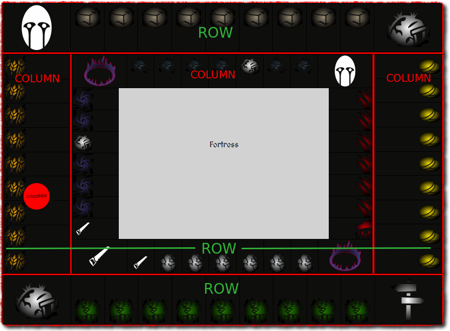
Did you notice the torn-paper-border of the screenshot? Yeah I know it’s perhaps a bit too much, but I was so thrilled finally finding Shutter to be a real alternative to ScreenPresso or Macs built-in Preview.app for image capturing/quick editing on Linux(Ubuntu), so I had to try out one of their built-in plugins ;)
So one of the nice things with flex is that you can define the flex-direction which will impact how elements are going to be stacked. The default is row, which means a horizontal stack of items whereas column, you guessed it, is the vertical layout. This is exactly what’s being used for the columns of the center row as an example.
1 | &__col {∂ |
But aside from that, there is one additional thing that would have driven me crazy for sure when designing with floats. The bottom row of tiles is created with the order of the tiles 1 -> 2 -> 3 -> n in DOM but actually should be rendered the opposite way n <- 3 <- 2 <- 1. So as the tiles are rendered via repeats from an array of tiles we could store the tiles in the exact order in the array. The problem here though is that calculations for dice rolls and player/monster progression are assuming the right linear order of tiles. Flexbox has us covered here with the flex-flow property which allows us to set the value row-reverse. Now that is super slick.1
2
3
4
5
6
7
8&__row {
display: flex;
...
&--bottom {
flex-flow: row-reverse;
}
}
I’m not even going to dive into things like justify-content: center and align-items: center which finally solve one of mankind’s biggest challenges in a simple and flex-order-aware!!! way.
found somewhere on memegenerator.net while Cloudflare said no with Error 522 :(
SCSS and BEM, a dream team
If you’ve been living on the other side of the moon for a couple of years, chances are you haven’t yet heard about SCSS (Sass) or any other CSS pre-processor. In short, writing vanilla CSS nowadays really isn’t the way to go any longer. Sure if you’re more on the CSSinJS department, you might found an alternative but even then you’re using something more capable. SCSS, the css-flavored style of Sass, is a widely used pre-processor that allows several urgently missing features such as selector nesting, partials, mixins and operators. Take a look at the official tutorial which should give you a good idea about its features.
Where SCSS really shines though is in combination with the naming methodology BEM, which stands for Block, Element and Modifier. Again the projects introduction page does a relatively good job of giving you an idea of what it is about. In essence, the biggest benefit are the resulting selectors with the least possible specificity. That means, if done right, you’ll never need to see !important again nor will you experience side-effects from other components. And all of that without having to use scoped css. Yes, the amount of characters for a typical class name gets longer but that cost is outweighed by the benefits you reap from the approach. Plus, being a methodology, every BEM project, with minor custom adaptions, will be structured the same for every project you encounter.
Let’s take a look at BEM and SCSS in combination in the code listing below. We can see that the block app has three elements sidebar, board and toggle-sidebar all indicated by the double underscores and neatly grouped by the nesting. Furthermore, the sidebar has the modifiers visible and hidden, which indicate the state of the sidebar. For some parts like the pseudo-selector :focus you might very well escape the strict naming convention just to find another gem like the mq-desktop mixin, which simply wraps the given content with @media (min-width: 1281px).
1 | .app { |
The later brings us to one crucial aspect of designing a game suitable both for mobile and desktop and that is a mobile-first design. If you noticed, the height, margin and width for the block have been defined at the beginning with mobile viewport sizes in mind. But with the mixin, we, later on, overload the values for a desktop specific viewport. The same happens for the toggle-sidebar button, where we can decide to remove the feature for larger screens.
Now as an example, applying the necessary BEM classes for the sidebar component would look like the following. We start with the element - part of the app block, followed by the elements modifiers, conditionally applied.
1 | <sidebar class="app__sidebar ${!sidebarVisible ? 'app__sidebar--hidden' : 'app__sidebar--visible')}"></sidebar> |
This might be repetitive and there is also potential to mix either the double underscores or dashes up. So I came up with a new Aurelia plugin called aurelia-bem and here is what it makes the above now look like. The global view function bem takes a block as the first argument, the element as its second and either a single or an array of modifiers as the third parameter. Once rendered it will turn it exactly to the sample shown previously.
1 | <sidebar class="${bem('app', 'sidebar', !sidebarVisible ? 'hidden' : 'visible')}"></sidebar> |
What you can automate you don’t need to remember
I’m a big fan of automating all the things for development wherever I can as it reduces the cognitive overhead and issues due to repetitive tasks. One great type of tools to support you writing proper code, guided by a set of rules, are linters. For frontend development, these come in the flavor of either TSLint or ESlint for TypeScript and respectively JavaScript, although lately TSLint got officially discontinued but offers a migration path towards ESLint. Well, the same thing is also possible with CSS and SCSS using tools like Stylelint.
The previously mentioned Aurelia Bem plugin comes also with a set of customized and opinionated rules for this type of setup. The game makes use of these by extending the plugin’s rules in the .stylelintrc.json config file while overriding some ignoredSelectors for the max specificity rule:
1 | { |
Besides that, this set of dependencies needs to be installed as devDependencies.
Now the linter will start shouting at you, whenever you try something that isn’t very BEM-like like using anything besides classes as a selector or nesting them too deep. Oh and of course no use of !important ;)
Conclusion
I must admit that I was scared about this part the most when creating the game since my design skills are far from what I’d like. But it turned out, that with skimming through some articles and playing around with flexbox, it was all in all not as bad as thought. Once again, I fell in love with the combo of SCSS and BEM and definitely wouldn’t want to miss them on any future project, while Stylelint constantly reminded me of things so I don’t need to keep them around in my head.
I’m sure there is enough room for debate on whether CSS Modules are the better way, or why not using CSS grid instead. Looking forward to the comments about your preferences.